“A good interior doesn’t only look good, it makes us feel good.”
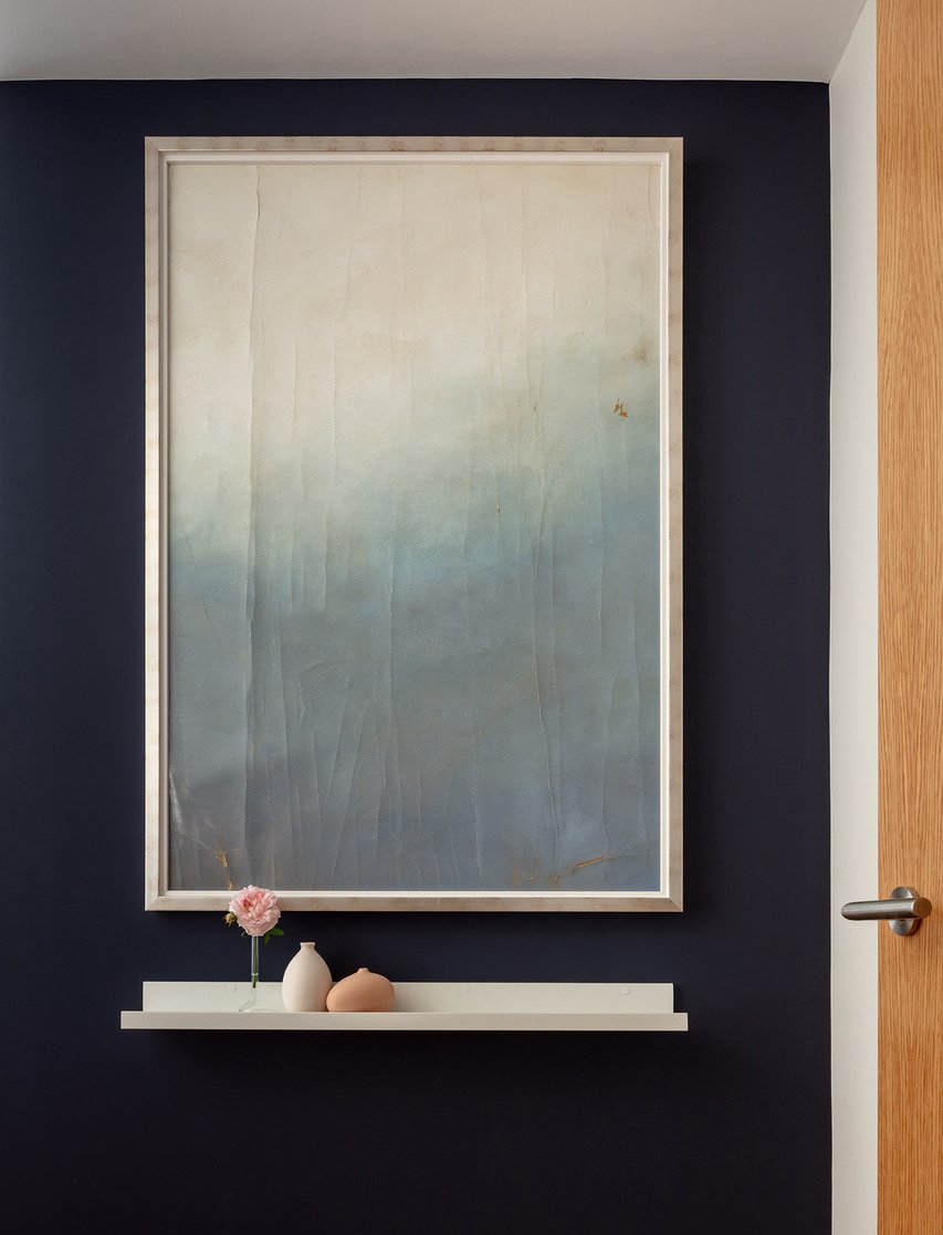
Creating spaces that make us feel good is a driving principle for me, and the beautiful artwork by Benjamin Raymond, with its blue-sky ambiance, invites calmness, serenity and wellbeing. My client, for whom I repurposed them, had lived in Japan, and embraced these tranquil elements, as well as the sense of purity and minimalism the paintings engendered.
The first piece envelops you on entrance, its muted shades of white and blue rising up out of the background wall’s rich, deep blue ‘2am’ colour from Coat.
You can find the second piece of blue sky next door, in the living room, edged with a striking red line of fabric next to the white wooden frame. The red accent was inspired by William Turner who dabbed a bit of red onto one of his magnificent seascapes – adding not only a buoy but contrast and further interest. I like to think there’s a similar – magnificent – effect here, in this room not far from the River Thames.
In addition to the wonderful synergy of the pieces in this home’s interior, I was delighted to be able to give new life to the artwork. Ever conscious of the waste in the building industry, I try to be resourceful and think carefully about the products and materials I’m using. As with all dream projects, the client and I connected – we shared empathy and trust – which made for a truly collaborative, creative partnership.
The end result: a home interior that the client loves and was a joy to create.
As we enter the summer, whatever this season may hold for you – I hope you find your blue-sky moments.
Credit: Photography by Marcus Peel


